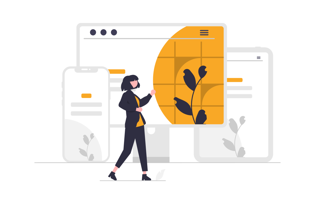
No matter what kind of website you have, it’s important to make sure it looks great on all devices. With so many different screen sizes and resolutions out there, it can be tough to keep your site looking its best. But there are a few things you can do to make sure your site looks great no matter what.
Use responsive design
Responsive design is a type of web design that makes sure your website looks great on all different types of devices. By using responsive design, your website will automatically adjust to fit the screen it’s being viewed on. So whether someone is looking at your site on a phone, tablet, or computer, it will always look great.
There are three main components of responsive design: fluid grids, media queries, and responsive images.
Fluid grids are the foundation of responsive design. They’re based on percentages, not fixed pixels. This means that your website’s layout will be able to adapt to any screen size.
Media queries are used to create different style rules based on the width of the screen. So you can have one set of styles for phones, another for tablets, and another for computers.
Responsive images are images that are the right size for the device they’re being viewed on. You can use CSS to control the size of images.
WordPress and Bootstrap are two popular frameworks for building responsive websites. Artificial intelligence can be used to make websites responsive too. However, using artificial intelligence for web design is still in its early stages and there are not many frameworks or tools available yet.
By following these tips, you can be sure that your website will look great on any device.
Use high-quality images
No matter what device your website is being viewed on, high-quality images are a must. This is because poor-quality images can make your entire website look unprofessional and sloppy. On the other hand, high-quality images will make your website look more polished and put together. High-quality images are especially important for people viewing your site on a retina display, such as an iPhone. This is because these devices have extremely high resolution, so any low-resolution images will look fuzzy and pixelated. To avoid this, make sure your images are clear and sharp. You can do this by using an image editing program like Photoshop to optimize your images for the web.
In addition to using high-quality images, you also need to make sure that they are the right size. If your images are too small, they will appear stretched and distorted on larger screens. If they are too large, they will take up too much space and make your website look cluttered. So find a balance between the two extremes and resize your images accordingly.
Finally, remember to test your site on all different types of devices. This way you can see how it looks and make sure everything is working properly. By following these tips, you can be sure that your website will look great on any device.
Test your site on all different types of devices
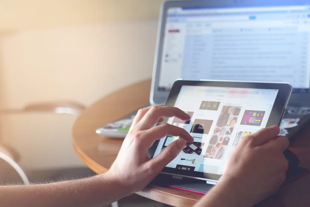
Testing your site on all different types of devices is important to make sure it looks its best. No matter how great your website looks on one device, there’s always a chance it won’t look as good on another. That’s why it’s important to test your site on as many different devices as possible.
One way to test your site is to use a tool like BrowserStack. With BrowserStack, you can test your site on hundreds of different browsers and devices. All you need is a URL, and you’re ready to go.
Another way to test your website is to use Google’s Mobile-Friendly Test. This tool will show you how your website looks on a mobile device, and it will also tell you if there are any issues that need to be fixed.
Finally, you can also test your website manually. This means opening your website on different devices and seeing how it looks. You can also ask friends and family to test your site for you.
By testing your site on all different types of devices, you can be sure that it looks its best no matter what.
Conclusion:
So, to recap, there are three things you can do to make sure your website looks great on any device: use responsive design, use high-quality images, and test your site on all different types of devices. By following these tips, you can be sure that your website will look great no matter where it’s being viewed. Need help designing and developing your website for all devices?